Brand Identity, Creative Direction, Visual Design
Vialattea
I developed the visual identity and creative direction for Vialattea, one of Italy’s largest ski resorts. The project involved reimagining the brand’s aesthetic across digital and print touchpoints, defining a cohesive visual system capable of unifying multiple locations and experiences under a single, contemporary identity.
The previous Vialattea logo relied on a geometric wordmark paired with a stylized blue ski trail. While recognizable, the identity reflected an early-2000s aesthetic and lacked the flexibility required for modern applications, especially across digital environments and large-scale resort communication.
Its visual language did not fully express the scale, cohesion, and contemporary positioning of one of Italy’s largest ski areas.
CREATIVE DIRECTION
Old logo
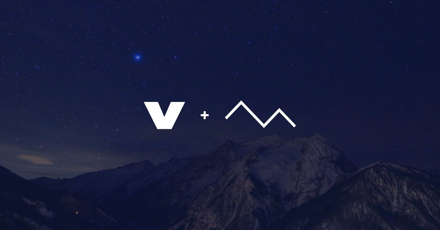
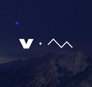
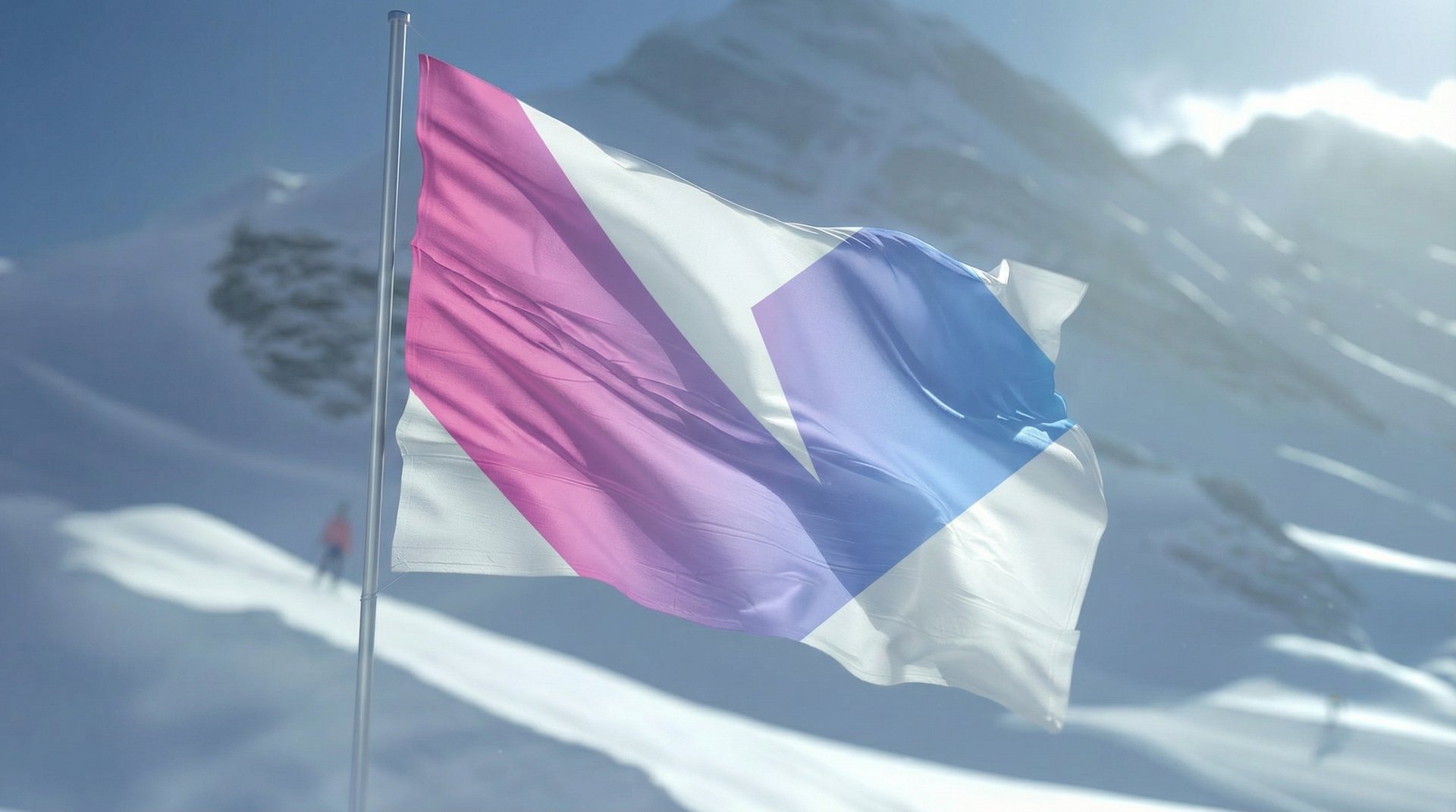
The new symbol emerges from the combination of two essential elements: the initial “V” and a stylized mountain silhouette. By merging these forms, the logo becomes immediate and iconic-an abstract peak that captures the essence of Vialattea while remaining highly adaptable across scales and applications. This construction creates a visual mark that is contemporary, geometric, and deeply connected to the Alpine landscape, without relying on figurative illustration or dated visual tropes.
MARK CONCEPT
To complete the identity, I paired the symbol with "Sequel", a bold geometric typeface that gives the wordmark clarity, strength, and excellent legibility at any scale. The color system uses bright gradients inspired by galaxies and nebulas, a subtle reference to the name “Vialattea.” These cool-to-warm transitions add freshness, visibility, and a distinct visual energy. Together, the typography and cosmic gradients give Vialattea a modern, standout aesthetic within the ski resort landscape.
COLOR & TYPE DIRECTION
Anakiwa Cyan
#99CCFF
Cerise Magenta
Deep Kove
#DC167A
#08103A


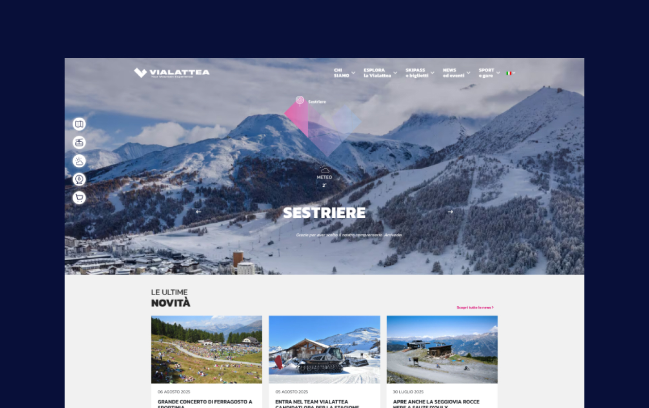
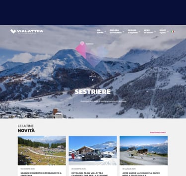
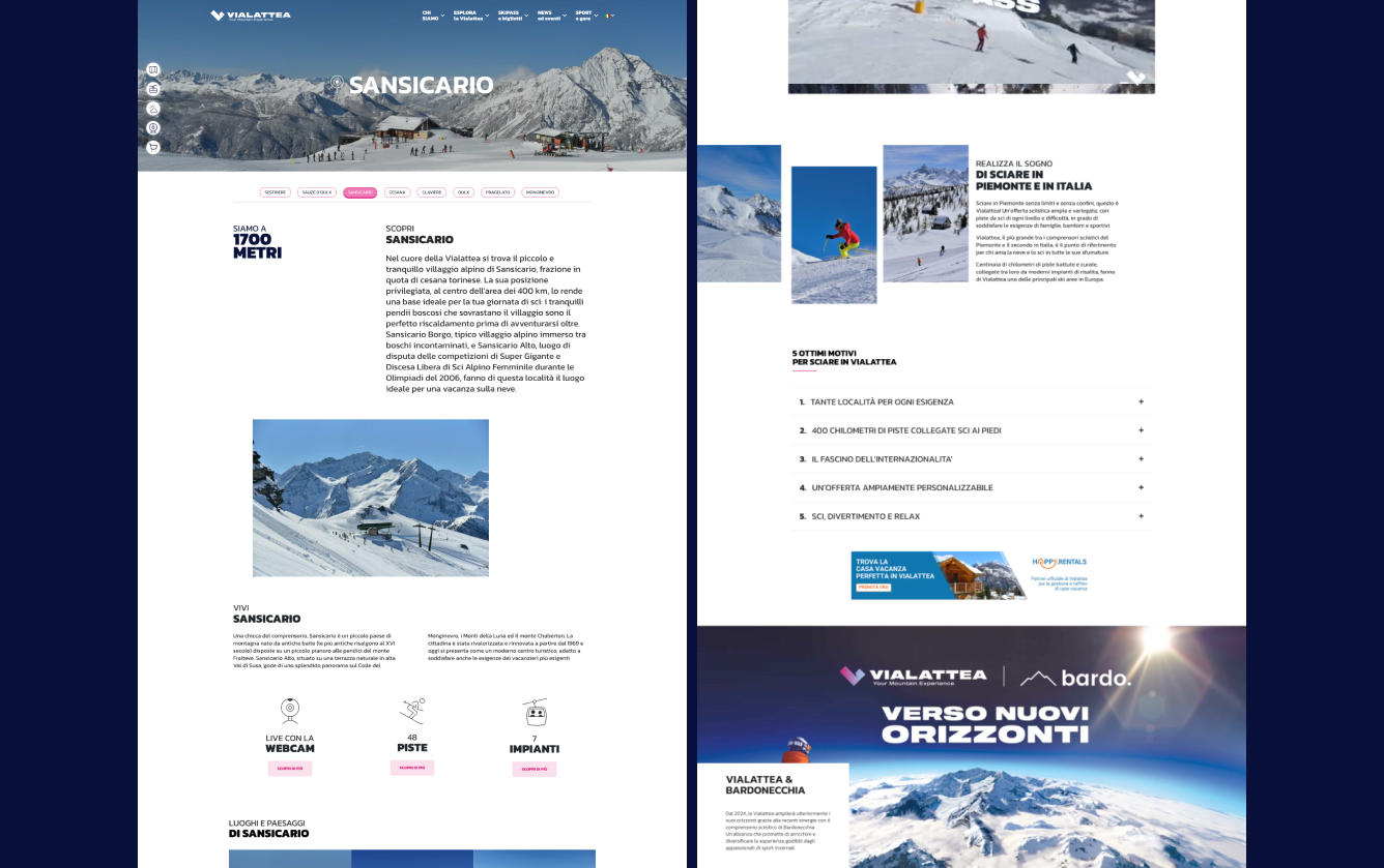
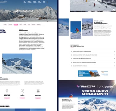
I collaborated with the UX/UI team to define the visual approach of the website, ensuring that the new identity extended coherently into the digital experience through layout choices, iconography, color use, and overall visual language.
WEBSITE
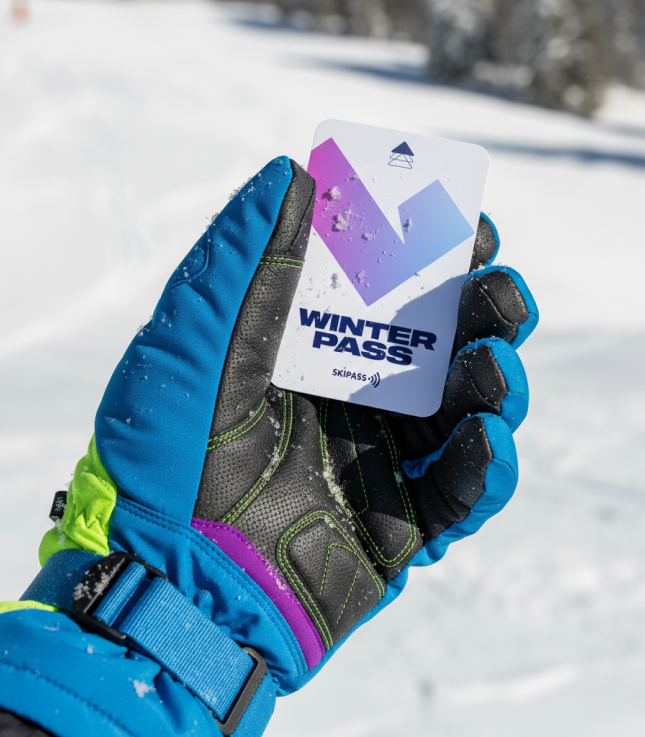
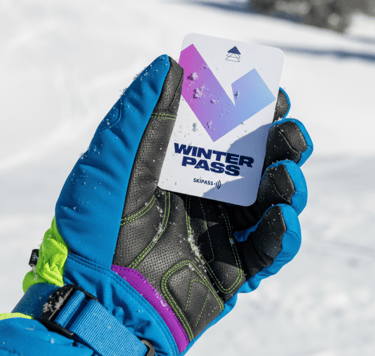
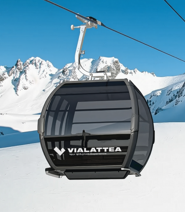
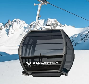
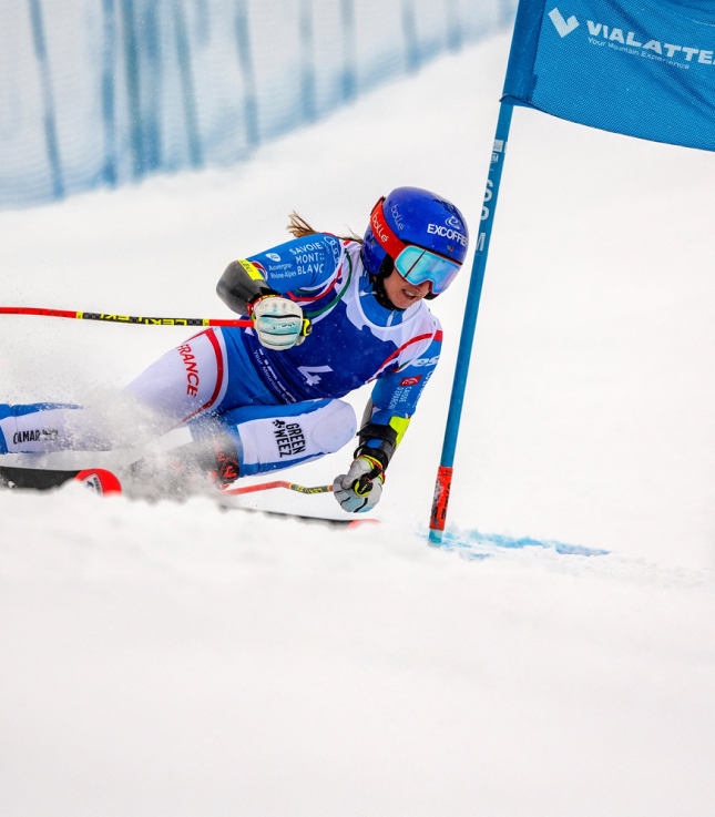
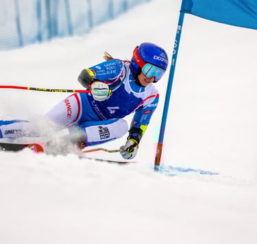
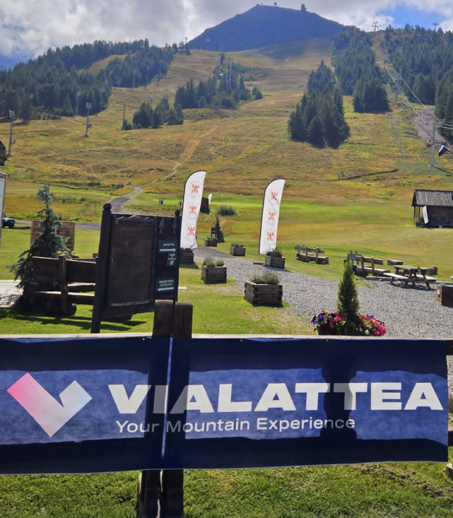
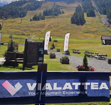
With the identity defined, I translated the visual system into key brand applications from ski passes to lift cabins and other on mountain touchpoints to ensure a cohesive and recognizable experience across the whole resort.
VISUAL SYSTEM IN USE