Visual Identity,
Concept, Branding
Beyond Architects
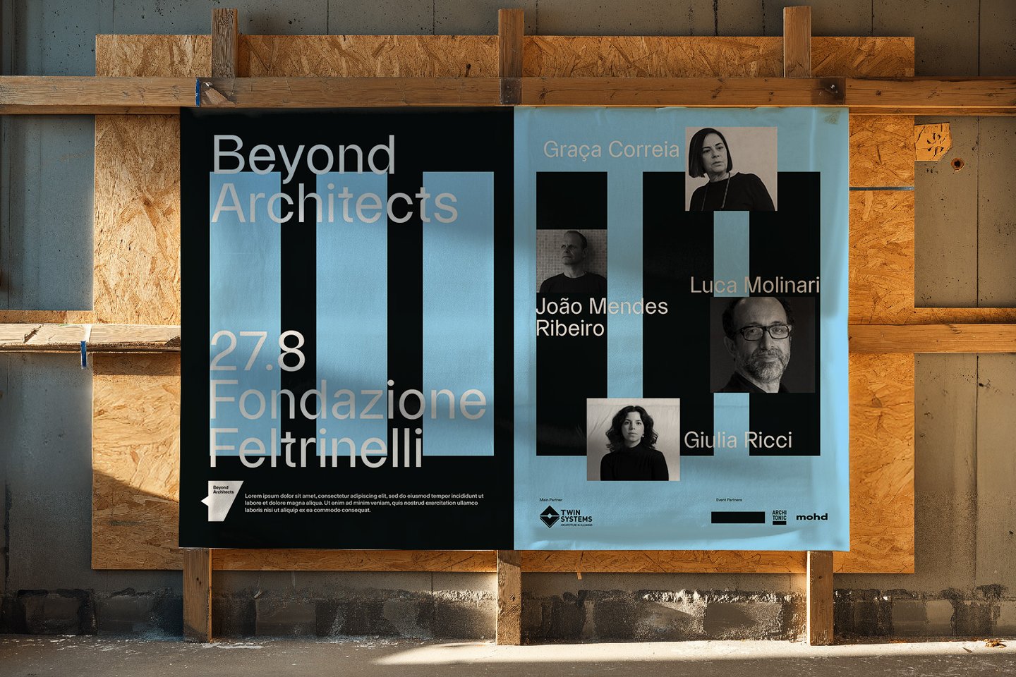
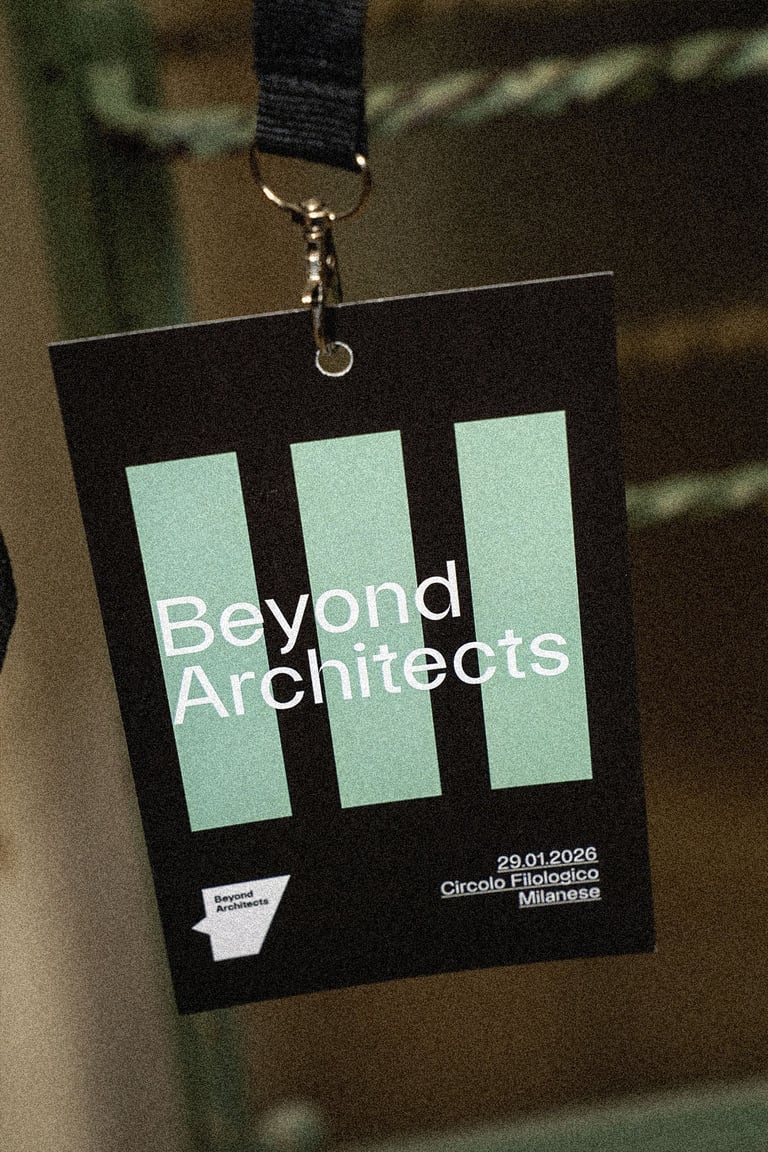
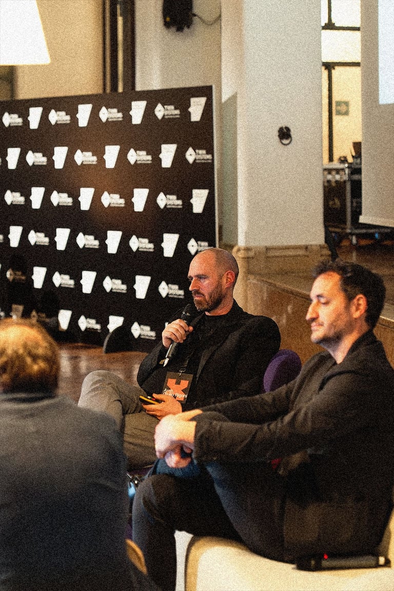
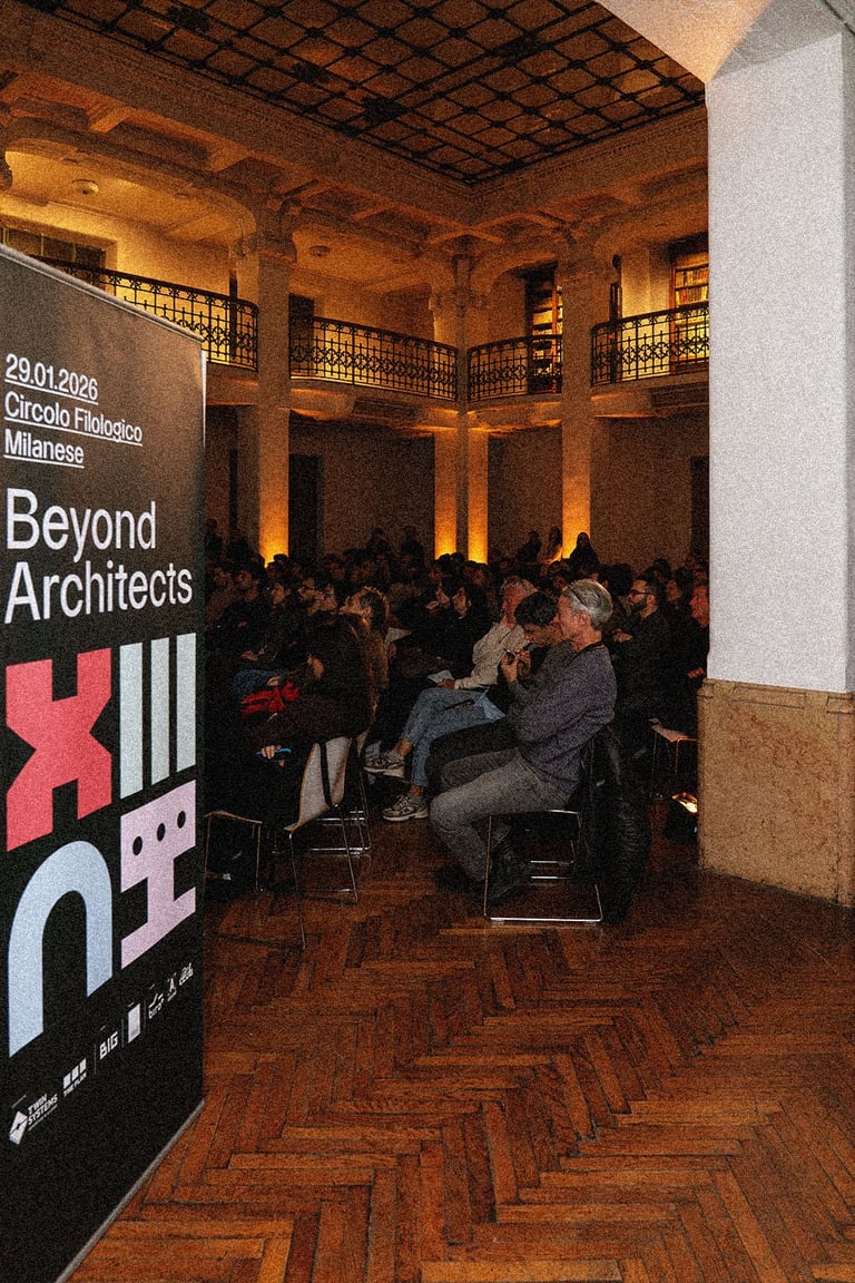
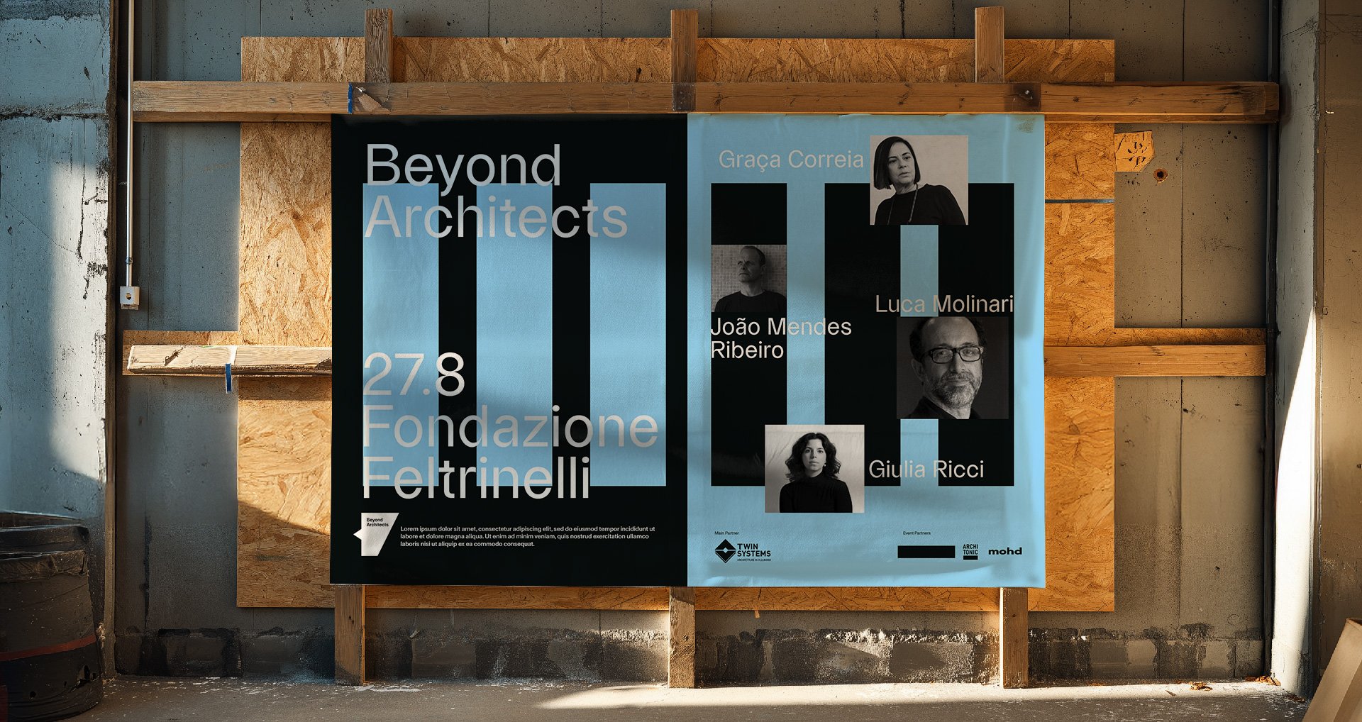
Beyond Architects is the curatorial format promoted by Twin Systems to unveil what lies behind architecture. I was responsible for developing the visual identity and graphic system, creating a distinctive and modular language that highlights the crafts, processes, and relationships that make every project possible.
Behind the figure of the architect, many other skills often remain invisible: artisans, technicians, contractors, suppliers, collaborators. They are the ones who make every project possible.
Beyond Architects was created precisely to bring this dialogue to light and to narrate construction as a collective process. The visual mark takes shape through subtraction: an extreme reduction of the letters B and A, from which a negative space emerges.
A space that may appear invisible, yet symbolically it is full: it is where those who work behind, alongside, and together with the architect are placed.
CONCEPT
Step 01


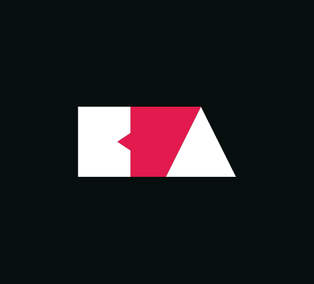

Identifying the negative space between the two letters as a symbol of the often unseen yet essential figures behind every project.
Step 02
Extreme reduction of the letters B and A into primary shapes, as the conceptual basis of the symbol.
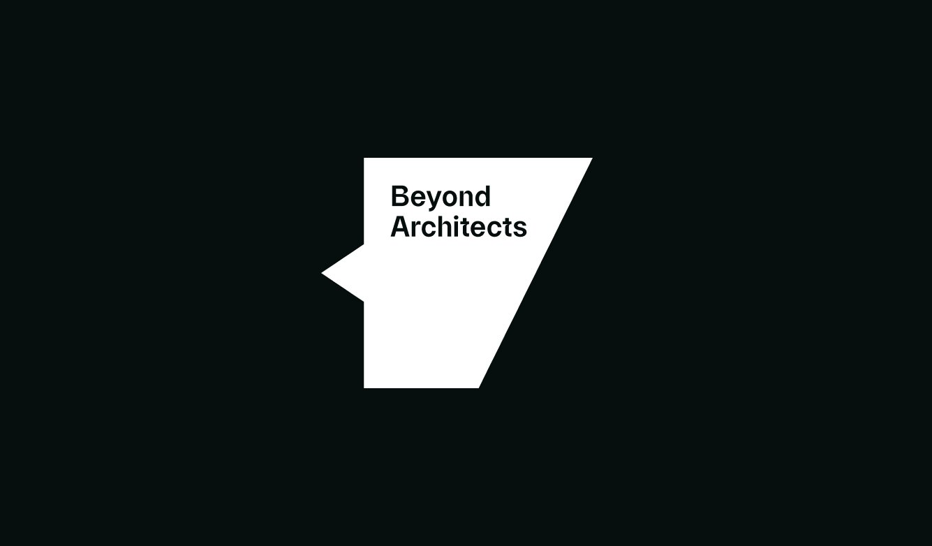
Construction of the logotype starting from the derived shape, which becomes the container of the naming Beyond Architects.
Step 03
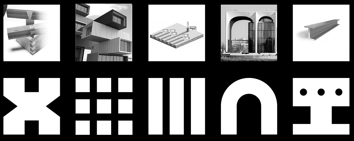
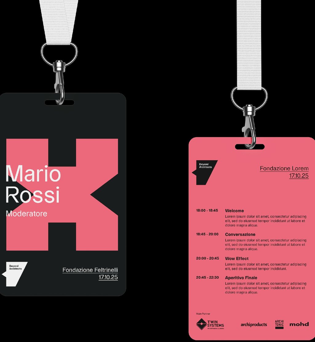
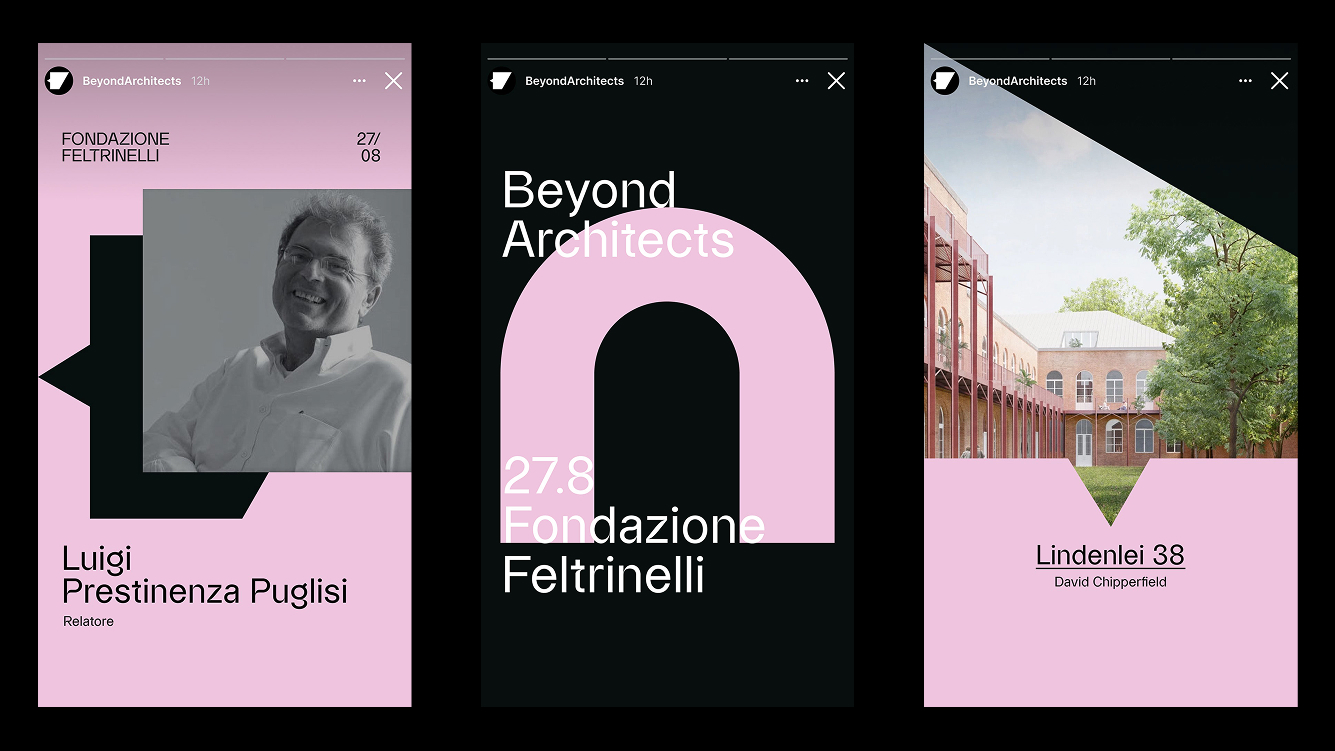
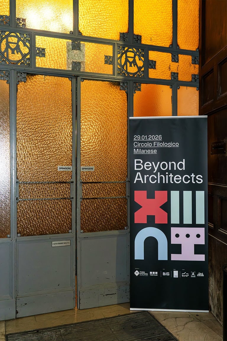
I have developed a system of essential graphic forms, inspired by technical and construction elements from the world surrounding architecture.
Each shape is conceived as a symbolic sign, yet it maintains a direct connection to the reality of the building site, the workmanship, and the materials.
The result is a modular visual vocabulary capable of representing people, practices, and processes through an immediate and recognizable graphic language.
GRAPHIC SYSTEM
